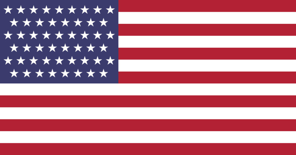
America’s flag is unique among national flags in that it’s dynamic, mandated to reflect the number of states in our political union. As the country expanded, there have been 26 official versions of the flag. Contrast this with Britain’s Union Jack which has been in its present form for 218 years. The reason I bring this up is that lately there’s been talk of creating states – either adding DC or Puerto Rico, breaking up California. (Or perhaps California will leave, which would be fine by me provided they annex San Diego to Arizona.) Can you imagine a 51-star pattern? It’s a really unwieldy number. I propose we go with a more permanent design, something that reflects our heritage in a simpler way. Canada did this in 1965 replacing its stodgy red ensign with the striking Maple Leaf flag.
The danger of a flag redesign is the current predominance of identity politics. Certain groups will want to give the new flag rainbow stripes or change it to use Pan-African colors. That’s why flag redesign proposals failed in Australia and New Zealand – too much bickering over honoring the Aborigines, the Maori, or other aspects of the modern diversity ideology. Besides, their existing flags look good as they are, the only drawback being that the two are quite similar – a blue background with the Union Jack and the Southern Cross. The two designs just have different stars.
Just for fun, however, I decided to try my hand at a US flag redesign. I’ve always loved the flags of the American Revolution – the Pine Tree flag, the badass Gadsden (rattlesnake) flag, the odd Bennington flag with its reverse-color stripes, and the classic Betsy Ross flag. Any design based on these would not only reflect our American heritage. It would have the added bonus of “triggering” the far-left ideologues who hate American history and are trying to obliterate it. I’m looking at you, Colin Kaepernick.
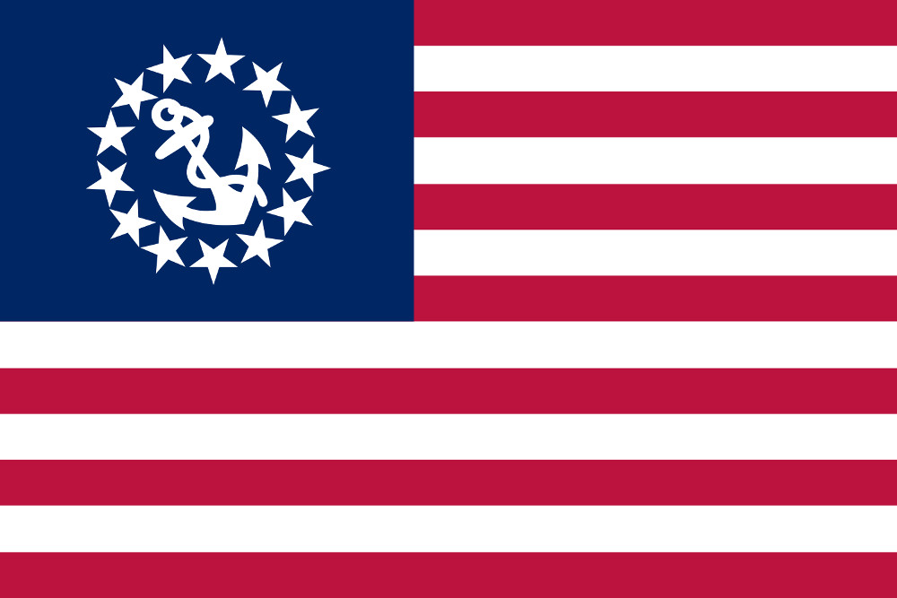
Another flag variation that looks really sharp is the US Yacht Flag, which is obviously based on the Betsy Ross design with an anchor in the circle of stars. My design starts there, replacing the anchor with that enduring symbol of freedom, the Liberty Bell. Since I’m not much of an artist, I’ve derived my outline from the 1976 US Silver Dollar, designed by Dennis R. Williams.
As for the stars, there’s no reason to have 13, since the flag already has 13 stripes. I propose the number 10 to represent the articles in the Bill of Rights. Instead of the traditional five-pointed star, I’ve used the beautiful seven-pointed variant from the Bennington Flag. In my symbology, the seven points stand for the seven articles of the US Constitution. Here it is, the Liberty Bell Flag – a flag that need not change to reflect our nation’s internal organization.

While I was at it, I tried at a number of other designs based on Revolutionary War flags. My second choice is one that’s sure to infuriate the Extreme Left, incorporating the golden rattlesnake from the Gadsden Flag. The four stars represent the four branches of the US Military. To make the snake more visible, I’ve lightened the blue background of the canton, borrowing the exact shade used by the flag of the Russian Federation. That’s at least three “trigger warnings” right there. I’d be reluctant, however, to add two more colors (gold and black) to the traditional red, white, and blue.

It may seem a bit blasphemous to propose redesigning the flag, but keep in mind that change is part of our traditional. The novelty of the Liberty Bell flag is its proposed permanence. I like my design so much I may just have a physical one made. In case any of you out there would like to do so as well, I hereby release it to the public domain.
Happy Independence Day!

